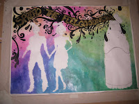
I an near the end of creating a camping for the Feel Good Drinks company. They also have a blog too, you should check it out:
The reason why I choose this Brief from the others from the YCN Briefs (the link is below) is because it appealed to me most from what I read from the brief, it sounded fun with loads of colour and for me to be able to come up with ideas to work with almost instantly it stood out. They also asked for it to be unique, which gives me the chance to show how my work compare to others entering, also it sounded challenging which you need to progress in your work.
Here are some photos of my progress though my final Poster:
This above is the final thing, it's not the final photo for the outcome, i will have to get a more decent one of it when I get it back from marking.
The soft sutiule dabbing ink in the background gives that cloudy soft feeling to it, also it brings out all the detail on the Characters and the Title and Bottle
I used Ink and black permanent markers for this. I haven't used ink much before and though I should divot to whole image to it, and I have always loved using black bold design lines in my work, so I used permanent markers as I can use them with more control than with a paintbrush or ink pen.


No comments:
Post a Comment